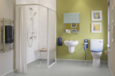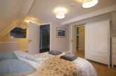
In search of a more contemporary approach to the use of colour and contrast for its J16 ward, St James’s University Hospital in Leeds sought the guidance of Dulux Trade and its team of Commercial Colour Consultants. Wanting to introduce a colour palette that supported those patients living with dementia, while still using a design led approach, staff at the hospital and Dulux Trade worked closely to create the ideal scheme.
Part of the Leeds Teaching Hospitals NHS Trust, St James’s University Hospital is Europe’s largest teaching hospital and home to the world-renowned Leeds Cancer Centre as well as an extensive range of additional specialities, including adult organ transplantation. With a desire to establish an all-inclusive environment, St James’s wanted to ensure that all patients, especially those living with dementia, are able to navigate their way around the hospital. Crucially — this needed to be achieved without losing the design aesthetic.
“Information regarding the needs of patients living with dementia comes from a variety of sources with no set legislation, only guidelines,” explained Tiffany Allison-Hall Commercial Colour Consultant at Dulux Trade. “Colour and the concept of contrast are often referred to however this can too easily be taken to the extreme.
Taking inspiration from the strong teal colour already found in the hospital’s signage and avoiding previous schemes of bright reds and yellows, the hues featured in the initial palette were harmonious tones that would sit either side of teal on the colour spectrum.”
To bring this scheme to life, a block colour panel next to each ward bay entrance was widened to ensure its visibility, with white stencils used to number the individual bays. Experiencing a high level of confusion is a common symptom of dementia and patients needed to be able to identify their bed bay. A feature wall stripe within each bay was added to further differentiate the areas and to accentuate the white number stencils.
For all wall areas, the products used are part of the Diamond range from Dulux Trade, both the Matt and Eggshell varieties. Tough, water-based emulsion paints, these products benefit from Diamond technology, making them 10 times tougher than the company’s Vinyl range. Both paints also include Stain Repellent Technology and will repeatedly wipe clean, making them ideal for high traffic areas such as corridors.
Dulux Trade Diamond Eggshell is quick drying and of low odour compared to solvent-based paints, and therefore ideal for use where ideally disruption should be limited. By helping to minimise disruption and avoid the need to close wards and other facilities, the Diamond range can contribute to patient wellbeing as well as efficiency and sustainability.
After early development of the designs the hospital expressed a desire for the entire building to be deemed dementia friendly. The additional two palettes, created for flexibility so the scheme can be rolled out across the hospital, were variations of the original. The first was a much softer and more muted collection of tones, used to create a calming environment and ideal for areas of high stress. Whereas the second incorporated a selection of uplifting colours, more suited to a younger patient demographic, to accommodate the needs of all patients within the ward.
David Gibson, Assistant Estates Manager for St James’s University Hospital commented: “I worked closely with Tiffany Allison-Hall who produced a number of different possibilities whilst still incorporating the same underlying theme. With a selection of colour palettes to choose from, it allowed us to speak directly with ward staff and ensure their input was heard before final decisions were made.”
Encouraged by the early success of the new colour schemes, the hospital has confirmed that in time, plans are in place for all the wards to be painted using the design Tiffany created. “Working with Tiffany has been an incredible learning curve and a real pleasure,” concluded David. “Not only did she produce a design that works for patients and staff, she also took the time to explain exactly how to use colour, providing the estates staff with detailed information about how to work with colour to provide a pleasant environment for patients, staff and visitors.”


